KarmaBoard
Brief : A job search engine seeks to understand first-time job seekers and design an experience that: “promotes them as people first through video introductions.”
As a solo lead UX/UI designer, I was instructed by the CEO and Development team to understand the young adult user base through research and surveys. I would then establish ways to help them adapt to this new job application format by redesigning the existing flows of the responsive web.
*To respect my NDA, research, data, and company processes will be excluded. This is a case study showing my personal process when answering a design problem.

Job searching is not easy for a first time job seeker.
But jobs sites don’t exactly make it easy for their users.
Job postings list all the skills required, and expect the user to figure out how to get them. They are also designed for user’s with a long job history and fancy job titles. This leaves very little room for people just starting off in the job market.
KarmaBoard promotes good, kind, and hard-working people that are looking for first-time work experience. They also aim to provide tools and educational media to help users understand key concepts of job searching that are not typically explained on job search engines.
My Role:
I operated as a UX and UI Designer under the direction of the CEO with a team of about 8 members. I would also take on graphic design and illustrative roles to aid the team with other facets of the company.
Goals:
1. Address current pain points of users within the website.
2. Design an intuitive walkthrough for users that easily explains the sign up and video process.
Constraints:
Although teens are more comfortable with phones, it was requested that I start with responsive web. The rationale is that public schools have shown a willingness to offer our product within their school computers, so we would be able to reach more teens after our first release. This would be a good opportunity to grow user base and get early feedback, but would also present challenges later when reducing the screen size for a mobile design.
Proposal:
By auditing the current design and compiling research for the use cases of teens, I would be able to quickly restructure the website within medium-fidelity wireframes in preparation for high fidelity. By setting up a space for a first-time design system, the team will have references when creating new flows.
Design Process:
As a freelancer, I came onto the team in the middle of this iteration. I was also requested by the team to fulfill specific deliverables as needed. Since research and user interviews have already been conducted, I followed this structure:
Research/Data Collection from Team) ➤ Design Audit of Current Screens (using existing interviews and data on users) ➤ Wireframing for Applicants Use Case ➤ Design System Created for future Iterations
Research
The team had already completed hundreds of interviews and spent hours on outreach with young adults and students. My team, with their current knowledge of the problem space, acted as my guides to give empathetic suggestions.
Target User/Market
Users : The target demographic for applicants will be young teens. The rational is that they (especially during the COVID) pandemic, have more flexibility and opportunity to start exploring their careers. They will also be learning how to apply to jobs for the first time, and that will be an opportunity to build a trust between the users if we can create a seamless job experience.
Background : High School/College, have little/no work experience. Have not decided what career would fit their needs.
Location : Northern California
Design Audit


Above is an example of my walkthrough with an early iteration of web and mobile. At this stage, I focus on the UX rather than the UI by following the Nieslen Usability Heuristics and basic rules of UX.
The first thing I looked at were the existing screens for the site. This was also an opportunity to familiarize myself with the site and the features offered to its users.
By looking through the lens of the teen/student user, I walked through the screens to see if the user could successfully sign up for an account and understand what the site offerings were. The offerings were clear, but in order to encourage users further to create accounts and profiles, I wanted to personalize the experience to a teens expectations. Here are a few ideas I brought to the team on this initial audit:
1. Reduce the text (to allow for skimming of important information)
2. Balance iconography with images (encourages trust when seeing faces, reduces confusion)
3. Nest correct sections under the corresponding top navigation (so users can find specific information)
4. Adjust language and tone with more concise words. (Aim to be professional but not intimidating to users)
5. Aim to include new features that show “Visibility of System Status.” (Progress indicators, anchored navigation.)
6. Allow for most important actions to stand out in the design. (IA)
7. Clearly encourage users that job searching is easier within the platform.
How Might We… :
…make the process of applying to jobs more successful for people who have no experience with job searching?
Wireflows
Now that I am familiar with the problem space and have an understanding of the user’s wants and needs, I started creating wireflows.


The above images indicate a red route of a user recording themselves on the platform.
In the first images you see how I quickly sketch a few varying options for how the flow could work. I then show the team and get their approval on one flow. This is not the end of designing, as I will certainly make changes as we encounter new edge cases.
In the second image, I have started using images to explain each step in the flow for my team. I usually draw on a sketchbook, but if I’m trying to save time (and paper) I’ll use an iPad and send my team the images.
Information Architecture
Going back to a teen user, the goal is to encourage and educate them to complete certain stages of their resume and profile in order to look their best for employers.
To illustrate this to my team, I would draw out the screens in low fidelity, and number actions by the most important for teens to complete. This helps me prioritize the architecture of each screen and make sure I am moving the user through the correct steps without any distractions.

In the image are three examples of the same screen, each prioritizing the most important actions with different design options.
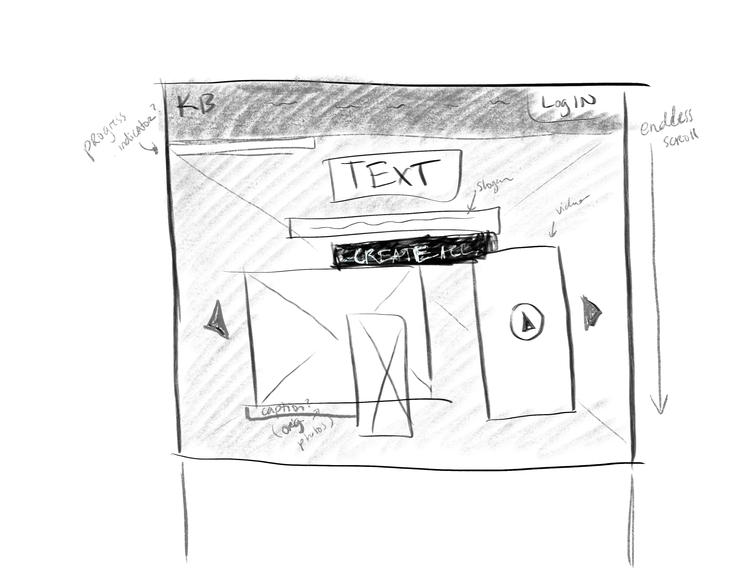
Wireframing

I jumped straight into wireframing after addressing use cases. Now, the site is taking shape! Video is a large part of the design, so I made sure it has some of the highest contrast among the other features. the highest contrast, of course, is the button for creating an account. At this stage, the top navigation has been reduced, and new tabs have been added to separate potential user types. The focus is on students, so we have their benefits listen right when you arrive to the site.
The profile has also been simplified, and changed to one singular infinite scroll page. The rational for starting off in dark screens was to mimic the teens most comfortable dark mode states, but also to psychologically call upon video/movie related platforms. When viewing video or images, dark mode is reminiscent of a movie theatre or a video game, so this is a familiar visual environment for young users. Ultimately, we will still offering light mode alongside.
End Result:
The final result is a design for responsive web and a few medium fidelity designs for mobile!
What I learned:
1. I learned a lot about teen users.
2. The startup world.
3. It also encouraged me to be creative with my time to make sure everything I spent time on would contribute to a successful design.
4. To make sure to always consider the UX side, even if my projects were UI focused.
Take a look at a few of my designs from sketch, wireframe, to high fidelity!


It was so fun and exciting taking part in this startup journey. It really reinforced my education and the challenge was awesome!
Thank you for reading!