House2Home
5 Day GV Design Sprint
Brief : By creating a minimalist, “color-themed” user sign up, an Interior Design website can provide catered suggestions and to young adults moving into an apartment for the first time.

About
House2Home is an interior design website offering small, unique pieces to help buyers decorate their homes. They are looking for ways to help their customer find items that match their unique criteria.
Problem:
The website is not appealing to the young adult demographic. Since the company sells primarily small decorative pieces, it would be advantageous to attract young adults buying for a temporary home. The problem is young adults have no interior design experience so it can be an intimidating and costly risk to buy new things. There are many obstacles to consider:
1. Young adults have a restricted amount of money to invest in design
2. Users are not confident their purchases will match other products they already own.
Goal:
1. Find a fun and exciting way to attract young users to the website.
2. Make the search for products easy to understand and within limitations.
Design Process:
I followed a classic 5 Day GV Design Sprint :
Problem and Concepts (Competitive Research + User Interviews) ➤ Design Audit for Audience Needs ➤ Design New Feature
My Role:
I implemented a classic GV Design Sprint as a solo project.
Research
The company has already implemented research strategies and user interviews and handed them off to me for implementation. They have quantitative and qualitative data, so I examined their interviews and personas to inform my decisions moving forward. The most obvious demographic was the young adult (22-27 year olds) whom are influenced by social media trends, but lack the financial resources and knowledge of interior design. These are some highlights of their findings:
1. Young adults are excited to decorate their first homes, but have concerns over various factors (price, size, weight)
2. Buying things, especially online, can cause overwhelm for users.
3. They lack interior design knowledge so the terminology on websites can be confusing.
Target User/Market
User: 20 somethings moving into an apartment (possibly rental home).
Location : City-centers and metropolitan areas.

Using Color as a Filter
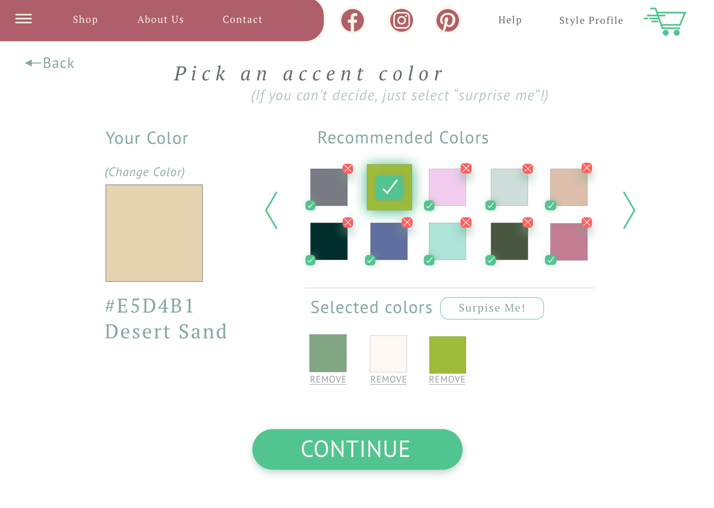
Users vary in terms of budget, space, and theme, but one thing that users know is what colors they like and dislike. Color is not an uncommon way of filtering products on e-commerce websites but I wondered how a color-led experience could be a more enjoyable way to shop for design pieces.

Concept Mapping
With this information, I began mapping different kinds of onboarding experiences that could encourage this color customization, and landed on a simple and fun way to narrow products.
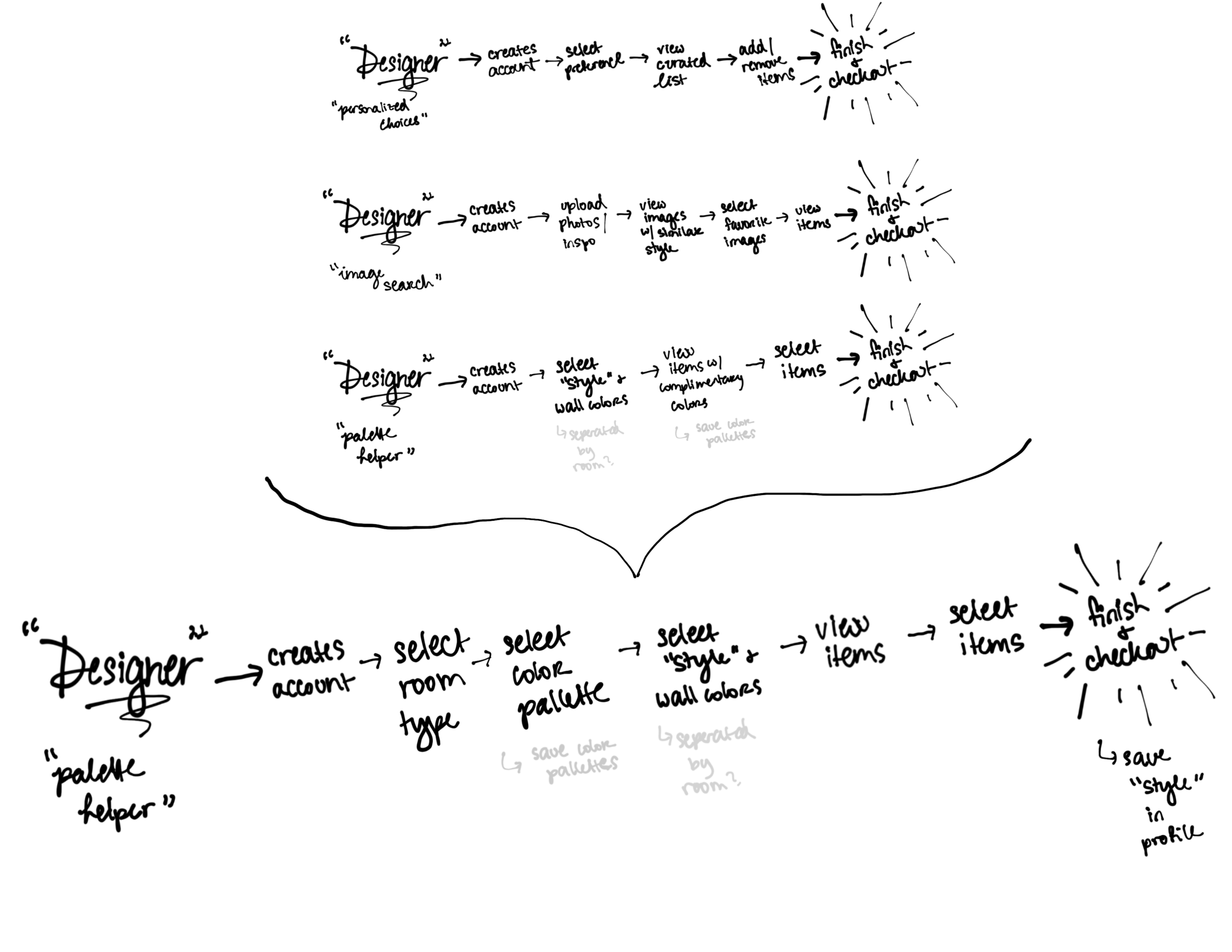
I explored different ways to help a young user through picking furniture. I explored image based searching, style quizzes, and apartment shapes. What I ended up landing on was an experience where users can select colors they like, and the website would suggest products to match the color scheme. This seemed to be a logical choice because so much data showed that users have confidence over colors, looks, and feels, even if they don’t have interior design backgrounds. In this flow, users pick the room they want to decorate, the colors they like, and saving “styles” that result from these selections.

Storyboarding
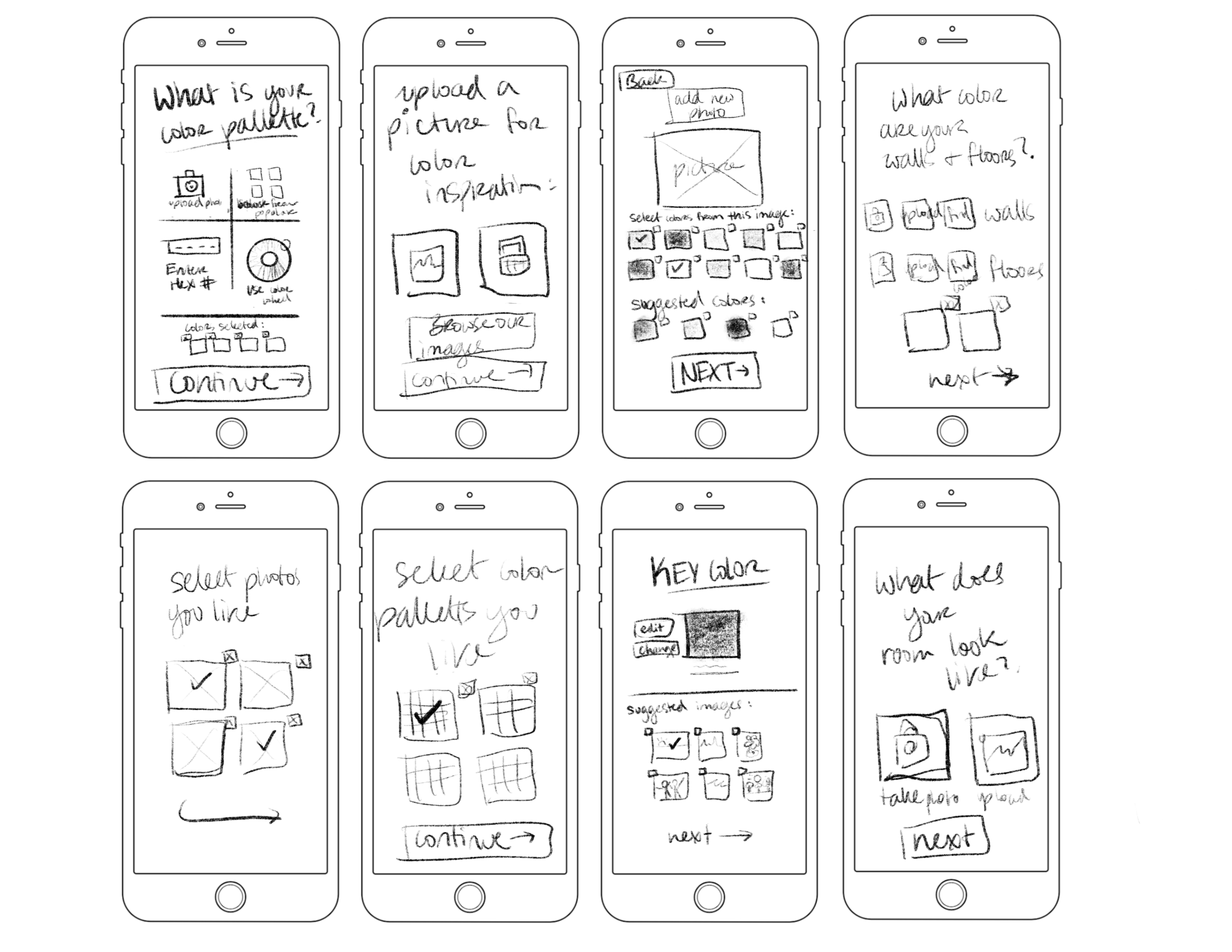
Users vary in terms of budget, space, and theme, but one thing that users know is what colors they like and dislike. These sketches illustrate the process of selecting colors they like using different methods available, then browsing “styles” that have the colors they selected. Since most people aren’t going to know the exact color they like by name, I explored giving them several options as to how they select colors. They can upload an image, they can view a selection of images, they can pick from a color wheel, or they can just enter the HEX.
After they have selected their color, they will be taken to another page that asks them to select secondary colors that they like with their first choice. In the screen, it would suggest to users what colors work well with the first color so they can compare and contrast moods of color combinations.

Prototyping the MVP
In one day, I made my sketches come to life through Sketch and Adobe XD. The biggest changes to my design came through adding colors, stock images, and extra UI features that I felt were needed as I worked.

User Testing
On the last day of the sprint, I tested the design on 5 willing users to see how this design operated in real-time. This feedback was vital to making the most important hierarchical and visual changes.
Some users pointed out that they would like to see where they are in the steps, and that it felt like there might be too many steps. I re-examined the screens and realized I could condense screens into one since I had plenty of negative space. A notable example was having breadcrumbs in the shape of a status bar to indicate progress through the design. Users also pointed out they liked the personality of the design, but it felt like a lot of text. Since it is an interior design site, I began integrating more images and icons to help break up the text.
As I made changes, I also realized that I included some features that would be unnessecary for a user to answer. For instance, users felt like they probably wouldn’t ask their roommates to participate unless they were their significant other. This made sense to me, and so I simplified the flow by removing it. This also eliminates the potential of another user not liking/second guessing the products.

“This page just feels a little plain. I understand what it’s asking but I don’t know how necessary this is.”

“I like that this page feels fun and colorful.”
Final Thoughts
Design Sprints can be overwhelming when you consider all the work that needs to get done, but if you take the time to research and consider the users needs, the design will appear on its own. The user does not have to be a professional interior designer to fall in love with unique pieces!
View some highlighted pages below: